After graduating from Cal in 2003 I stayed in the Bay Area and continued to coach lacrosse.
I coached a youth Berkeley club team and did a bunch of private lessons for a few goalies in the area. I also worked a little with the goalies at Cal.
As I worked with these goalies the same questions kept popping up over and over.
I wanted some place to write up the answers to the most common questions that I kept getting so instead of repeating myself over and over I could simply point the young goalie to the post I’d already written.
I considered a few options for the brand name and eventually settled on Lax Goalie Rat. Because a lax rat is someone who eats, breaths, and sleeps lacrosse, I was the Lax Goalie Rat.
Lacrosse really was my passion and when I was on a walk, or at the gym, or even at my desk at my day job ideas for goalies would run through my mind.
Thus was born the brand and the Lax Goalie Rat blog in 2015. I published a post per week for the better part of 3 years.
I learned an amazing thing happens when you write. It forces you to organize your ideas.
While before I might be able to riff rambling and incoherent thoughts for a few minutes on a question (and believe me – some online coaches do this all the time and it drives me nuts). When you sit down to write a blog post your thoughts must be crisp, concise, and absolutely clear.
Writing helped me explain lacrosse goalie concepts better than ever before.
But the early blog had no logo.
Just the words “Lax Goalie Rat” written in Rock Salt font. Rock Salt!?!

You can actually see the old blog design on the Spanish version of the site – Lax Goalie Rat Español
In 2016 I translated a bunch of posts into Spanish to see if there was any traction there. There wasn’t.
The Logo First Version
Around 2017 when I wanted to redesign the website I realized I needed a logo. Something memorable that helps gain a little brand recognition.
I went to 99designs to hire a graphic designer to create the 1st ever Lax Goalie Rat logo.
If you’re not familiar with that site, essentially you submit your project description and your budget and then designers start to submit logos. The winner is awarded the budget for the project.
As the project kicked off the logos started to flow in…
But none of the options really grabbed my attention. One of the logos even had me questioning if the designer understood the difference between a rat and a snake.
I was close to cancelling the entire project when a final option came in.
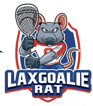
It was exactly what I had in mind. An athletic looking rat who looks like a lacrosse goalie with a goalie stick and not overly cartoonish.
Let’s just say we had to kiss a few frogs (or ugly rats) before we found our prince.
I gave the designer some color way suggestions, font suggestions and asked to change the rat’s number to 30 (my college number) and we landed at version 1 of the Lax Goalie Rat logo:
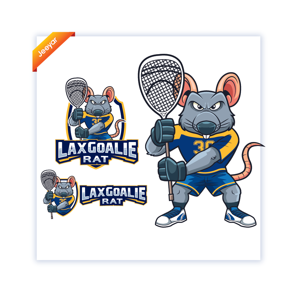
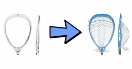
The logo stayed this way for about 6 months until I realized the rat could really use a restring job on that stick.
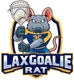
The designer twisted him up Mr. Wanderful style with a fresh twisty.
Alt Versions Are Born
For a few of the projects I was working I wanted a slightly different version of the logo.
Something that let everyone know its slightly different and yet still the classic Lax Goalie Rat brand you’ve come to know and love.
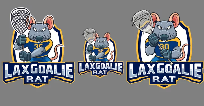
I went back to the same designer and asked for a new angle yielding this beauty:
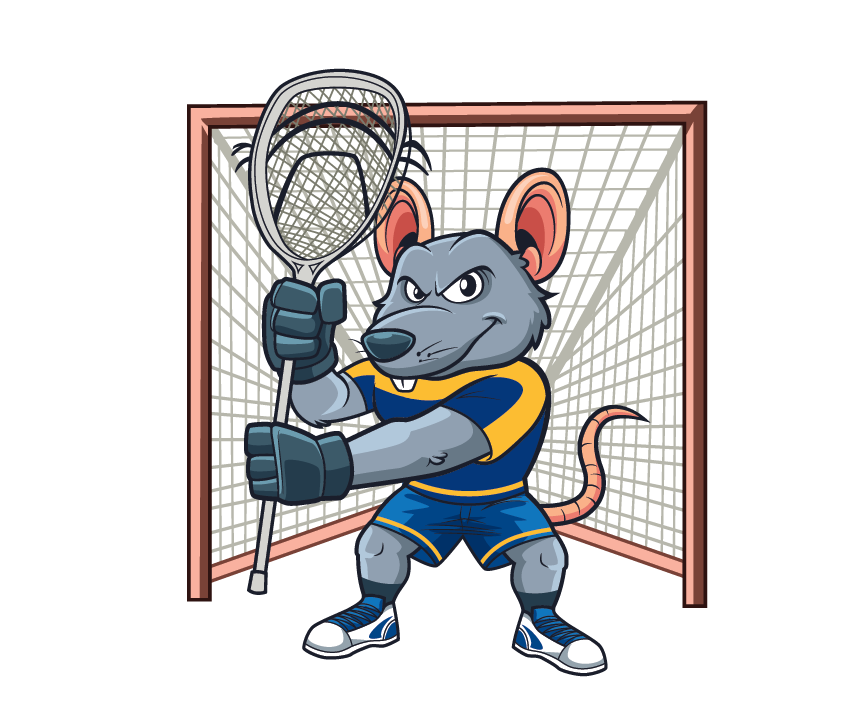
This logo is the one for the Lax Goalie Rat Academy which is my membership site full of lacrosse goalie drills, techniques, workouts, practice plans, etc.
The Logo Corrects His Stance
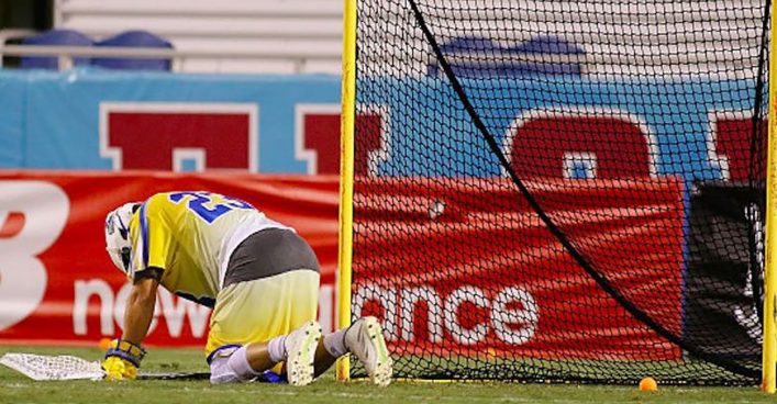
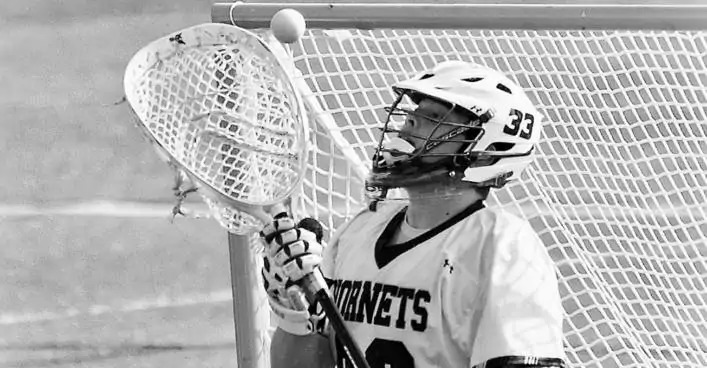
When I first wrote up the brief of the 99designs I included a picture of a lacrosse goalie for reference.
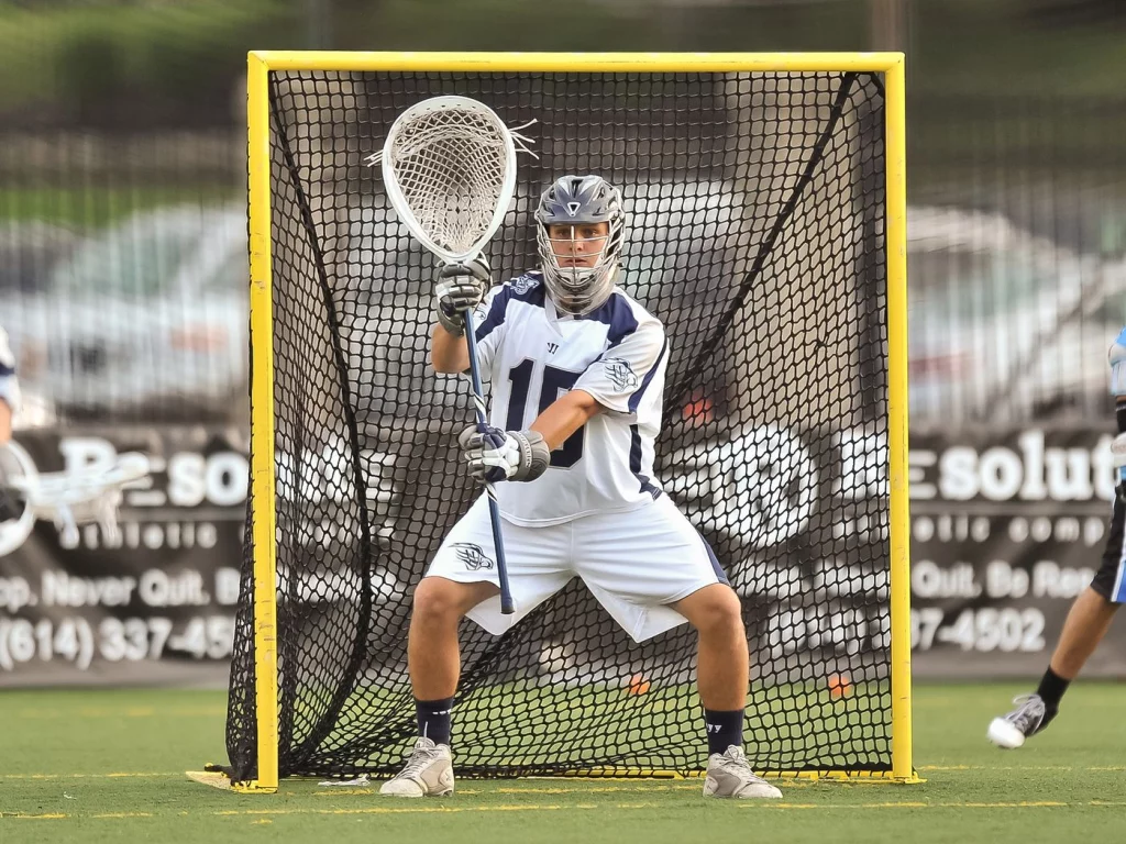
That is Kip Turner. He’s currently an assistant coach at the University of Virginia and back in the day he played in the MLL on the Bayhawks.
Kip Turner led the league with a 10.51 GAA and finished second with a 54.4 save percentage leading the Bayhawks to their record 4th MLL Championship in 2012.
Looking at the pic compared to the logo and its safe to say the designer nailed it.
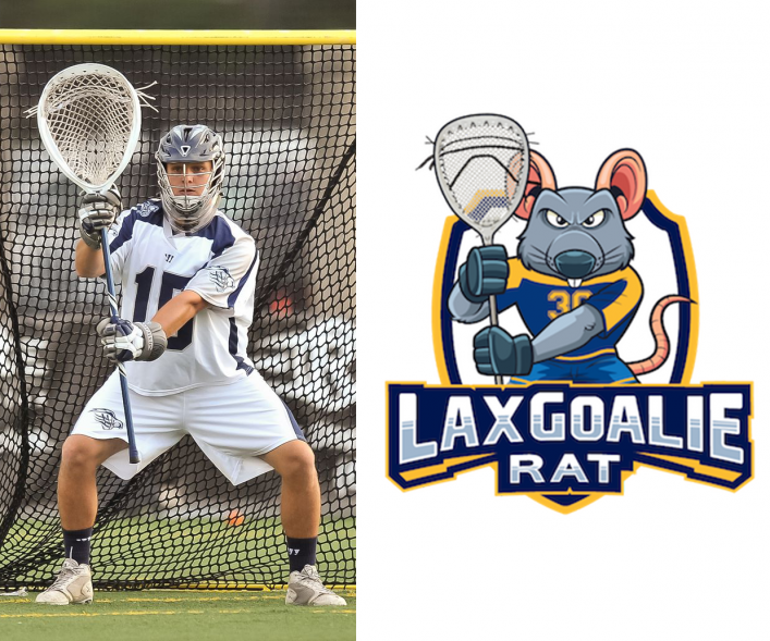
But here’s the thing about that lacrosse goalie stance. It’s actually no longer recommended. Even Kip Turner himself said he doesn’t teach anyone to play like that.
When your arms are locked out like that you’re not in an athletic position.
If you watch slow motion of saves with a stance like that, most of the times the goalie’s first move is to flex the arm a little and then move to the shot.
As a goalie, any inefficiency must be cut out of your save movement and thus we cannot have locked out arms.
I grew tired of looking at my logo with a horrible stance. So I hit up my designer to get some modifications.
This time I sent him this pic:
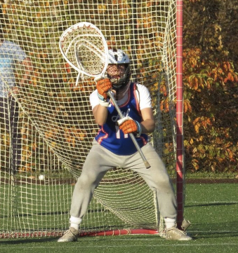
That is Anderson Moore and he’s committed to play for the Georgetown Hoyas.
It’s one of the best stances I’ve seen and was actually featured in Parker Fairey’s presentation describing his approach to goalie in Lacrosse Goalie Summit 5.
The designer came back with this:
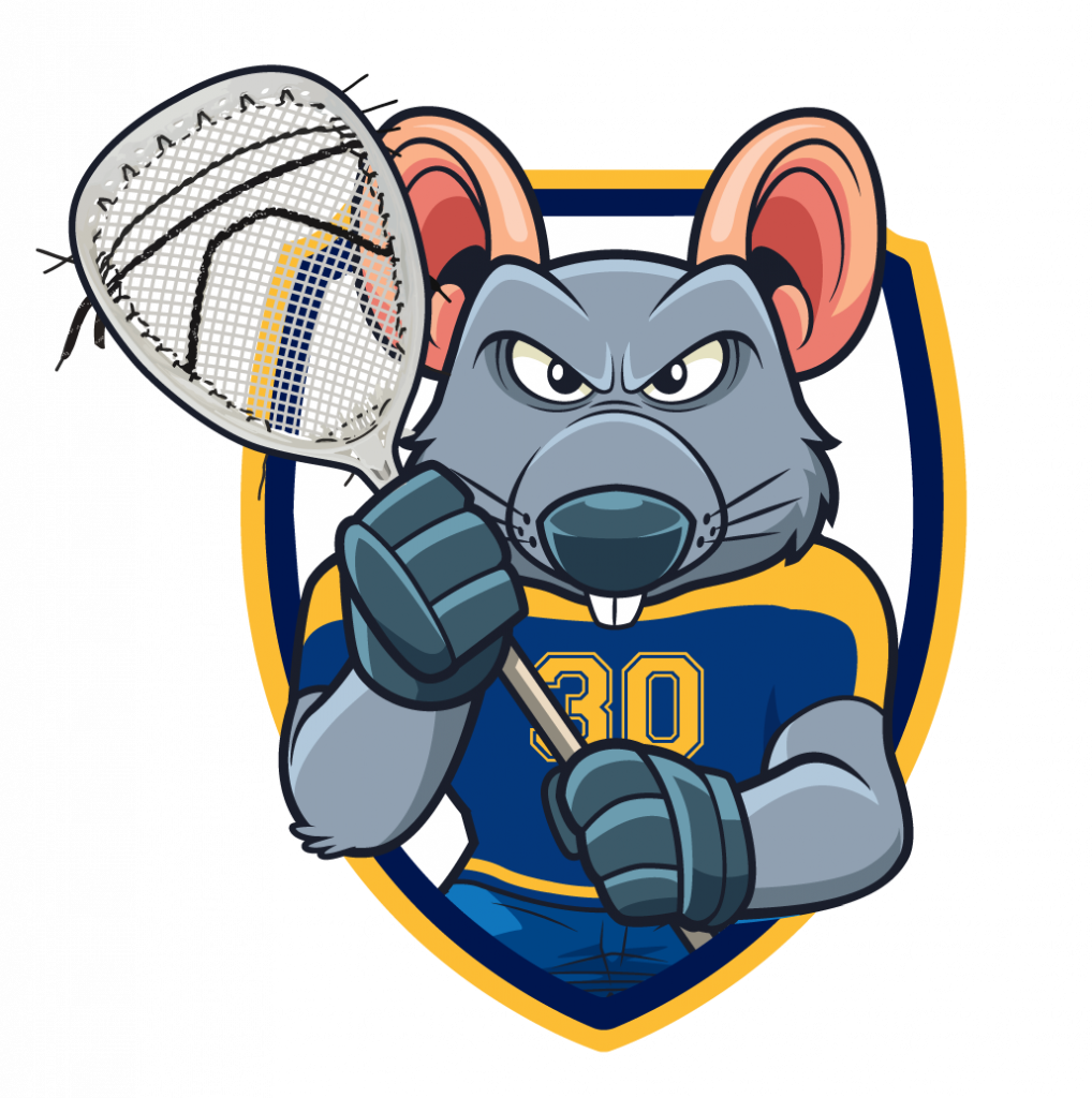
Not sure why he went so short on the shaft. Those arms also look a little flabby to me.
Sent my feedback back to the designer for more shaft and more arm muscles and we arrived at a brand new version of the Lax Goalie Rat logo:
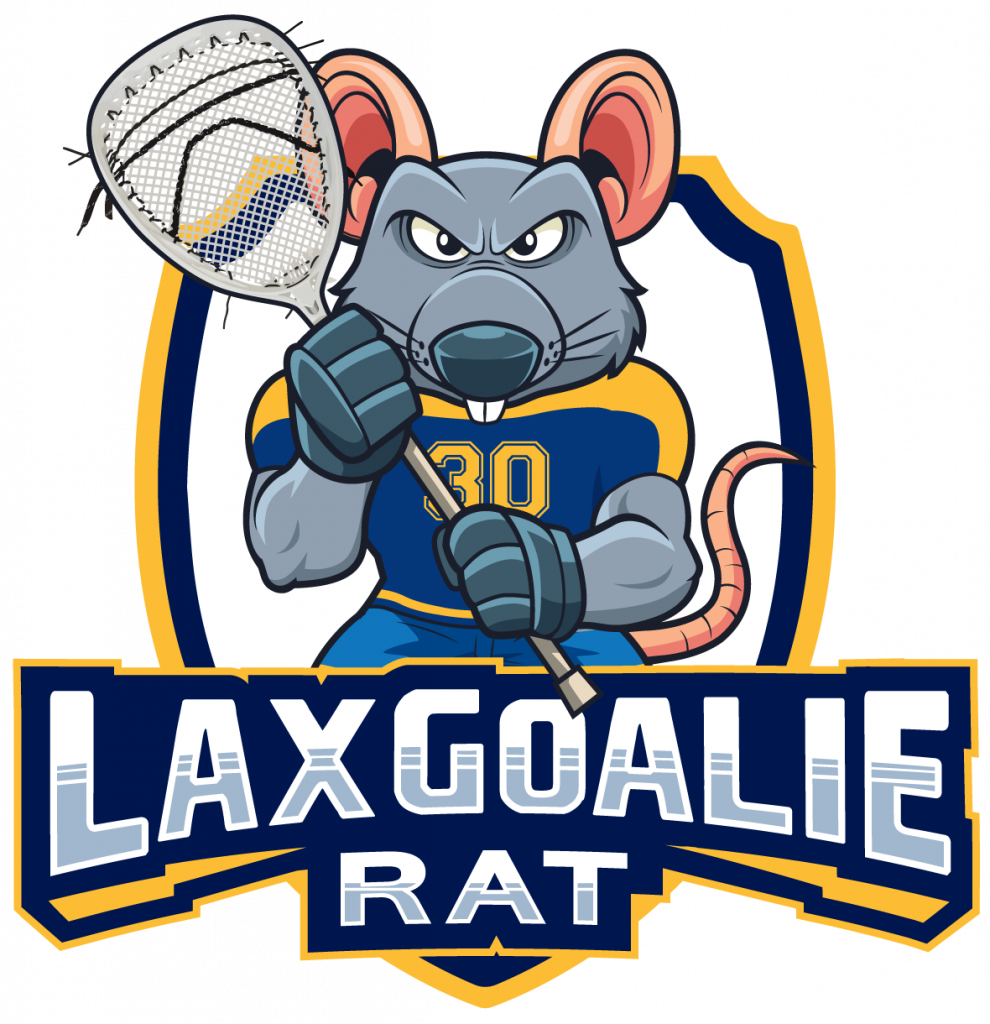
Beauty!
What do think of the new logo? Leave me a comment down below with your opinion.
Until next time, Coach Damon


 14 Amazing Lacrosse Goalie DrillsAug. 1, 2024
 Quick Guide To Lacrosse Slang TermsApril 14, 2025
 Lacrosse Goalies Rules To KnowJune 28, 2022
 Lacrosse Goalie Step-by-Step Guide to Getting RecruitedFebruary 6, 2022
 18 Lacrosse Goalie Drills to Improve Your GameApril 24, 2025
 7 Elements of a Great Lacrosse Goalie StanceAug. 1, 2020
 12 Lacrosse Goalie Tips To Take Your Game to the Next LevelSeptember 10, 2024
 STX Eclipse 3 Goalie Head ReviewApril 24, 2025
 Lacrosse Goalie WorkoutAug. 12, 2019
 The Basics of Making a SaveJune 29, 2021


















I always wondered where your logo came from. Thanks for sharing! I love your attention to detail as the logo evolved. Great story and I’m glad you didn’t go with the snake
Your loyal follower,
Haha thanks Mom! Can’t have the snake logo when you’re the Lax Goalie Rat! Love you!
That was a great story on your logo evolution. I find the tail to be distracting. Love you coach dad.
Stop looking at the tail Dad! haha love you!
I understand you telling the evolution of the Lax Rat logo. But I would rather you do not use my entry in the 99design contest as a logo you “didn’t like” in you story. My 99 design name is photomrk and my entry is the blue logo, the last example on the bottom. Please remove my design from your story. Thank you.
Hey Coach- My logo design is still on this site. Please remove it.
removed